Snapshot. Talisman’s onboarding was broken in two ways, and I owned fixing both. First, the product looked too plain for anyone to trust it with their spend, so almost no one completed onboarding. We brought in a designer, I ran a full revamp, and we relaunched to win #1 SaaS Product of the Week and #2 Product of the Day on Product Hunt, plus This Week in Fintech’s Startup of the Year. The relaunch then exposed a second problem: users still were not activating. I drove the empty-state and Quick Verify fixes that took onboarding completion from effectively zero to about 80%.
The problem
We first built the onboarding during Techstars and put it in front of our cohort and network, the best early signal you can get. The signal was bad. Overwhelmingly, people did not complete onboarding, and the few who did never got to value fast enough to come back.
Part of it was uncomfortable to hear: the product looked too plain to be taken seriously. Prospects pushed back on even starting onboarding and asked to see a demo first, which read as a trust problem. Internally we named it directly. There is a fine line between looking simple and looking immature, and we were on the wrong side of it.
Phase 1: the revamp
We did not defend the work. We treated “it looks too plain to trust” as a real product problem, not a cosmetic one.
I brought structure to a full revamp. We brought on a designer, Sam, and rebuilt the experience around everything users had already told us. I ran it as PM: I wrote the design and engineering tickets, recorded walkthroughs of each page and flow, set the meeting agendas and pre-reads, and kept the work moving to a shippable release. I had designed the first version of the product by hand myself, before we had a designer, so I knew exactly what needed to change.
We relaunched in February 2024:
- #1 SaaS Product of the Week and #2 Product of the Day on Product Hunt
- This Week in Fintech, Best New Startup / Fintech Startup of the Year (2024)
- 78 new customers in the first days of the launch
Phase 2: the activation fix
The relaunch solved credibility, but with real users flowing in it exposed a second problem. The data was blunt: of 27 early users, 8 never finished onboarding, and most of those who did never actually got to use the tool because the setup was too confusing. The product only became useful once a user confirmed their subscriptions, and people were stalling before they ever got there.
I drove the fix. The empty state new users hit asked them to connect an account or add a subscription, when the real next step was to confirm the subscriptions we had already detected. I reframed that moment around the actual next step, and we built the Quick Verify Inbox to make confirming subscriptions fast instead of a long, complex chore. I wrote the tickets, set the daily design priorities, and ran QA on the build.
Outcome
After the activation fixes, onboarding completion went from effectively zero to about 80%.
Before and after
The clearest proof here is visual: the plain early product next to the revamp.
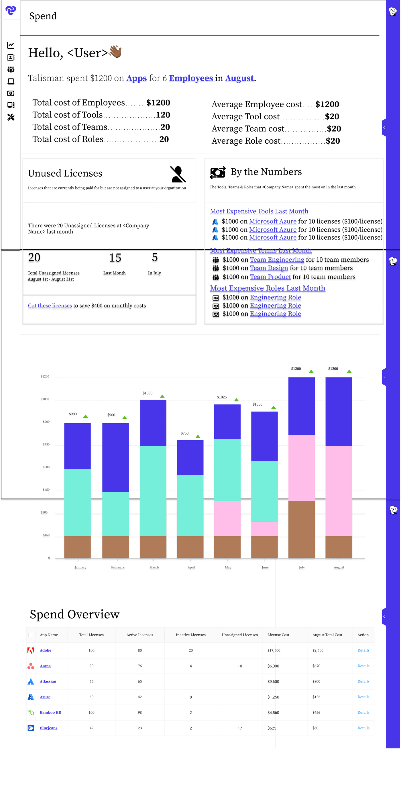 Before: the earliest design prototype of the product that we used to express the idea. Functional, but plain enough that users did not trust it with their spend. Rooted in real design systems from Mailchimp and Intuit at the time.
 Spend Overview 2.0. We brought on a contract junior designer, after finalizing our initial scope, to take my rough prototype designs and turn them into an actual UI that had consistent principles applied across the board.
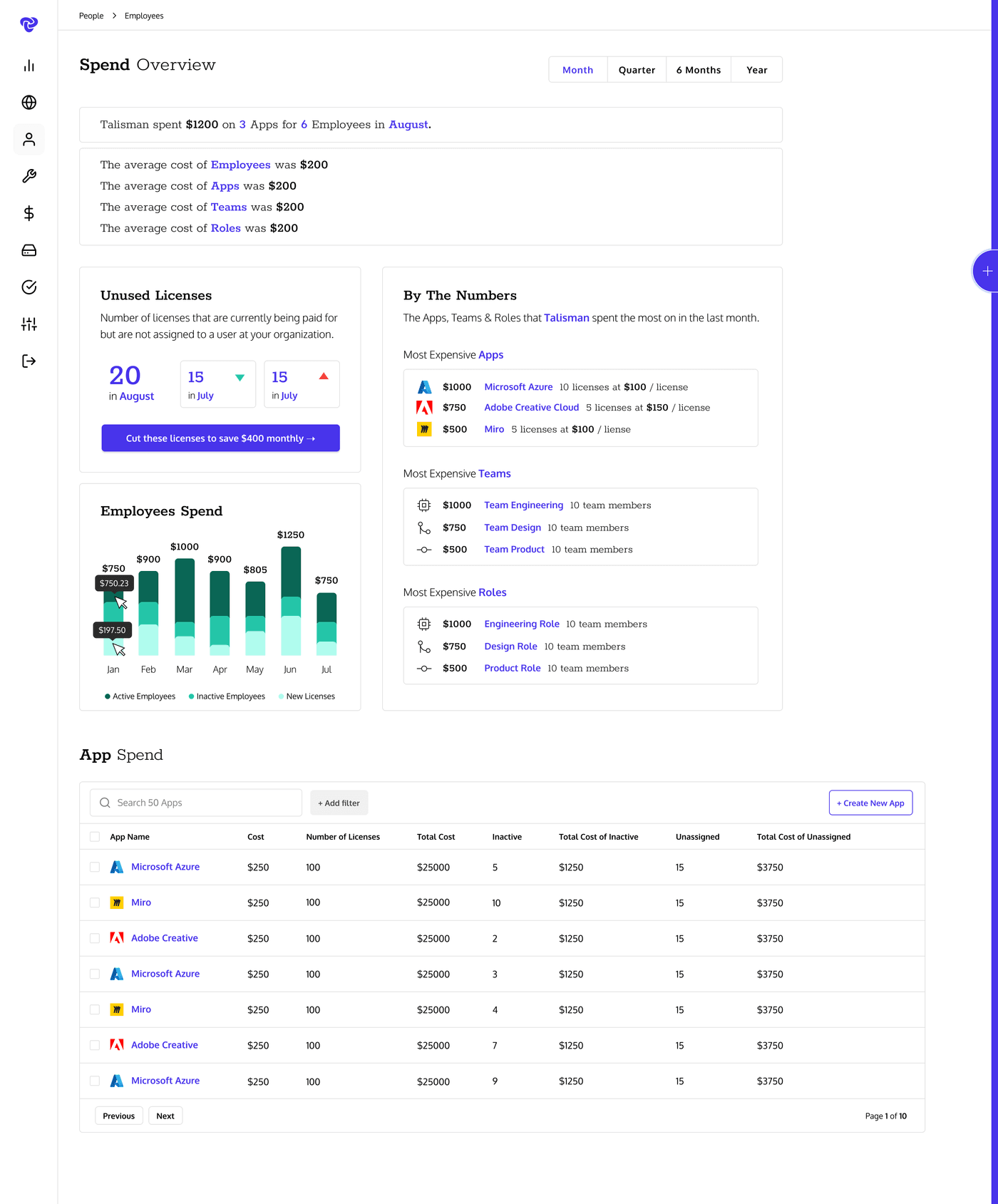
 After: the revamped Spend Overview 3.0, after bringing on a full-fledged UI designer. We held many meetings with customers and dived into research to land on the version that we launched on Product Hunt in February 2024.
Artifacts
I designed the very first version of this product by hand in 2022, before we had a designer. That progression, from my rough drafts to the plain built version to the award-winning revamp, is part of the story and is something I am proud to truly have had my hands on from the very beginning.
Source files (internal, for interview walkthroughs):
- Alpha designs, hand-built by me, mid 2022 (Figma)
- Final Pages, the early built product (Figma)
- 1A Release, the revamp with Sam (Figma)
Reflection
Product iteration is anything but linear. But it all circles back to getting regular, constant feedback from users. Without this, you are walking in the dark.